Ladakh Logo Row: Lessons Not Learnt Will be Perilous
Representational use only.Image Courtesy: Wikimedia Commons
“What’s in a name?
That which we call a rose
By any other name would smell as sweet.”
It seems this famous quote from Shakespeare's Romeo and Juliet commands the decision of the Ladakh union territory (UT) administration in deciding the emblem/logo of the region.
But name and logo both matter here, as they should represent the ethos of the region, its cultural diversity, and so on. The Ladakh administration has shred all such concerns aside. According some people this writer spoke to on a recent visit to the UT, both in Kargil and Leh, the current logo finalised by the tourism department of Ladakh exhibits “sheer dullness”, not just in the design and colour but also in the attitude of the administration toward the people.
The UT administration is a powerful body governed by bureaucrats with a completely overshadowing budget for Kargil and Ladakh regions. Just imagine that Kargil and Leh administrations, governed by two elected councils, have a budget of not more than Rs 300 crore, whereas the UT administration, with no democratic control and no accountability toward the people, spends more than Rs 5,500 crore annually.

The common refrain is that the people of the region wanted to get rid of the triangle between Leh-Srinagar- New Delhi and hence were optimistic about the changes brought in the administration. But, after three years, New Delhi is “superimposing complete control” over the hill region.
The Logo Controversy
The main controversy that erupted over the UT’s logo is that it does not relate to the region at all. The controversy has also brewed owing to the complete indifference of the UT administration, i.e., the Delhi government that controls the UT administration.
The major demands of the region pertaining to tribal status, protection of land laws, protection of their identity, and the local people be made equal partners/stakeholders in the developmental model, have all been belied by New Delhi.
People are angry over the prolonged unconcern shown by the Central government, despite the fact that politically the region has overwhelmingly voted for the ruling party, the Bharatiya Janata Party or BJP, which won the lone Lok Sabha seat from Ladakh and also has a majority in the Leh hill council. Kargil is governed by the National Conference (NC).
The logo has three mountain-shaped triangular tops followed by a letter “LaDAKH”, and a line at the bottom saying “DISCOVER yourself”. The logo is not just dull but does not depict any relevant information either about the region or the people.

The logo controversy erupted in 2021. Immediately after its finalisation, there was outrage on many platforms, including social media. The Leh Hill Council rejected the symbol. It asked the UT administration to reconsider the logo as it did not gel with the ethos of the region. With more than 10,000 views on social media, the CEC of the Hill Council also openly opposed the decision on the logo.
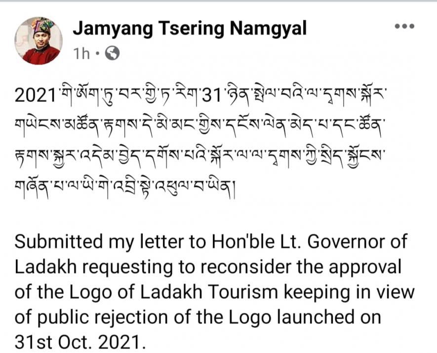
The member of Parliament also raised his objections. He wrote a letter to the Lieutenant Governor of Ladakh on October 31, 2021, and sought his intervention to reconsider the decision on the logo keeping in view the “public rejection”.
There were some interesting observations and comments on the logo over social media. One comment posted on social media said, “The cultural department has cleared their hands from the mess….. Then why isn’t the statement for rectifying and reconsidering the Ladakh Tourism logo been issued yet? Is the tourism department on the direction of few ‘Gyagarapas’, thinking of ignoring the heated situation and just imposing the logo forcefully on local Ladakhis??”
“Has the administration become more powerful and monopoly than the elected representatives?”
What is a Gyagarapa? This Ladakhi dialect term, which literally means white-clad people, is used to refer to a ‘foreign national’, often for persons from the rest of India. This is an observation by common people who are now describing the monopolisation of administration over the elected councils as a “takeover”. This will further alienate the people.
The tone of the social media response of the people reflects of simmering discontent.
‘Logo not a wedding card invitation’
Sonam Wangchuk, in his message, said, “…The general public needs to know who all were on the selection committee. If it were some bureaucrats then for sure, it went the wrong way. It is not a process of selecting some wedding invitation or visiting card…local experts in designing and creations should have been given the right to finalise it. Ladakhi mass doesn’t need justification but reconsideration and rectifying the drama caused due to the pathetic design.”
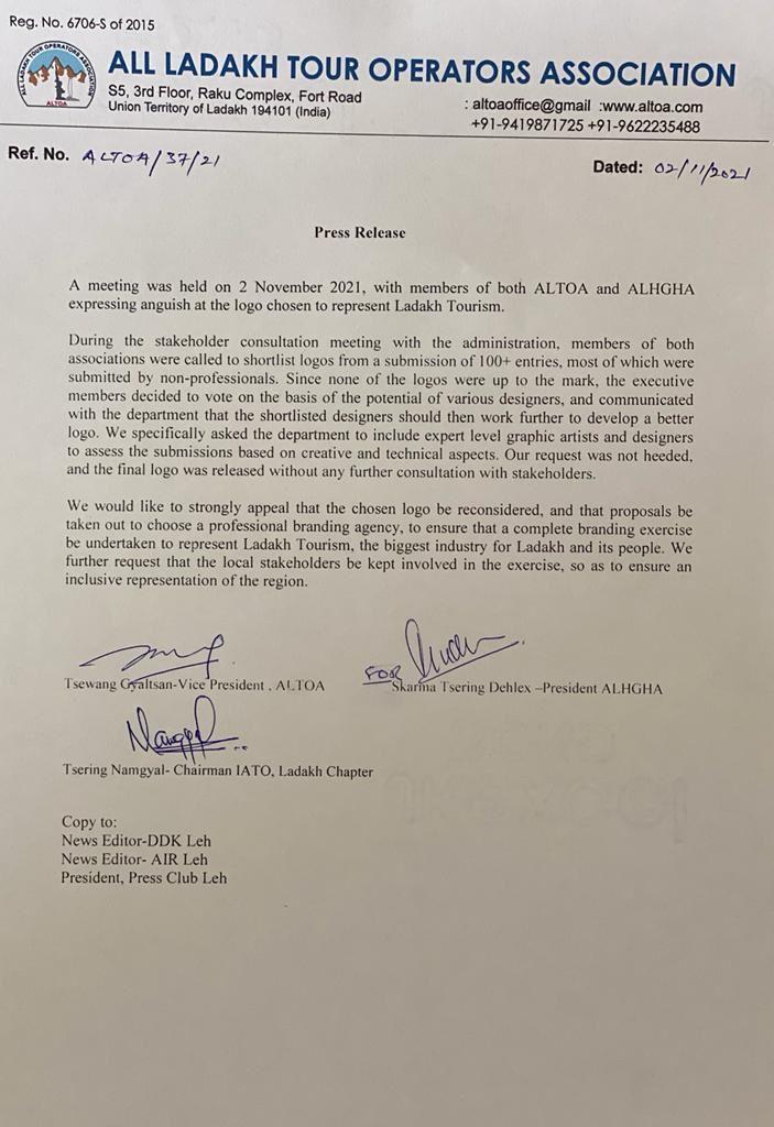
The All Ladakh Tour Operators Association-ALTOA and ALHGA, the two biggest tour operator associations in the region, also issued a press note on November 2, 2021, deploring the logo and calling for its immediate withdrawal.
From people to intellectuals, to political people to trade associations, everyone protested and objected to the logo that was approved by the UT administration.
The UT administration in its reply, despite massive opposition, even from the ruling party, did not pay heed and went ahead with the logo. In a reply, it said that due process was followed and a payment of Rs 1 lakh was given to the designer whose design was shortlisted by the committee deciding on the logo. The UT administration termed itself to be a competent authority to decide the logo.
Why the hue and cry now?
Though it has been nearly a year now, the logo issue is once again reverberating in the region. No surprises then that BJP faced humiliating defeat in a bye-election to the Leh Hill Council, where Congress won with a huge margin. The elections were held in September 2022.
Despite the fact that the UT is a de facto BJP functionary from the Centre, and also the fact that the current hill council of Leh is controlled by BJP, the people overwhelmingly defeated the party in the council election.
A year later, the logo continues to upset the people and its imposition is seen as a “gyagarapian” feature of New Delhi.
Symbols are important in the formulation of consciousness of the people. The interesting debate between architecture icons, Edwin Lutyen and Laurie Baker, while designing New Delhi was also about symbols. Baker emphasised the cultural ethos of the new capital that was being formed, and hence favoured a blend of two cultures.
In Ladakh, the logo is an important feature of the identity of the people, hence, the simmering discontent with New Delhi.
The writer is former Deputy Mayor of Shimla, Himachal Pradesh. The views are personal.
Get the latest reports & analysis with people's perspective on Protests, movements & deep analytical videos, discussions of the current affairs in your Telegram app. Subscribe to NewsClick's Telegram channel & get Real-Time updates on stories, as they get published on our website.


